Project Details
- Deploy status : Live on Netlify
- Github : Trillo Rep
- What We Did : Website development
- Tech stack : HTML, Flexbox, CSS, SASS
- Completed : September 2020
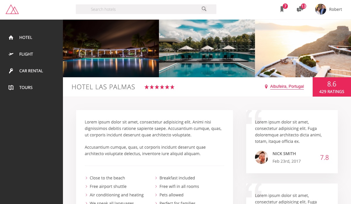
Trillo Website
Sample website for a touring company that demonstrates modern responsive design using HTML / CSS / Flexbox.
This project employs the basics of CSS and SASS styling for HTML seen on my Natours project but particularly focuses on the Flexbox capacity of CSS to highlight its power. Flexbox provides a more efficient way to layout, align, and distribute space among items in a container, even when their size is unknown and/or dynamic (thus the word “flex”). The main idea behind the flex layout is to give the container the ability to alter its items’ width/height (and order) to best fill the available space (mostly to accommodate to all kind of display devices and screen sizes). A flex container expands items to fill available free space or shrinks them to prevent overflow.
CSS preprocessing is accomplished using SASS. The SASS applies variables, mixins, selector nesting, partials, imports, extensions and more to improve CSS power, and create a cleaner, more compact and maintanable code base. Advanced styling techniques such as animations with @keyframes and transtions, clip-paths, background-clip, shape-outside, backdrop filter, transform, object-fit, perspective, and calc() are used to showcase the power of CSS styling.
Classes and selectors are built using the BEM (Block-Element-Modeling) design convention and employ complex selectors, and pseudo selectors. Addtionally, the 7-1 rule for component-based design architecture is applied to promote reusable, scalable, and maintainable code.
Responsive design principles are incorporated for users with all kinds of devices using advanced CSS media-queries. Responsive design creates a pleasant user experience that scales from widescreen monitors down to small handheld phone devices.
Technology:
CSS, SASS, HTML, Flexbox