Project Details
- Deploy status : Live on Netlify
- Github : Nexter Repo
- What We Did : Built page with CSS Grid
- Technologies : CSS, Grid, Flexbox, SASS
- Completed : June 2020
Nexter
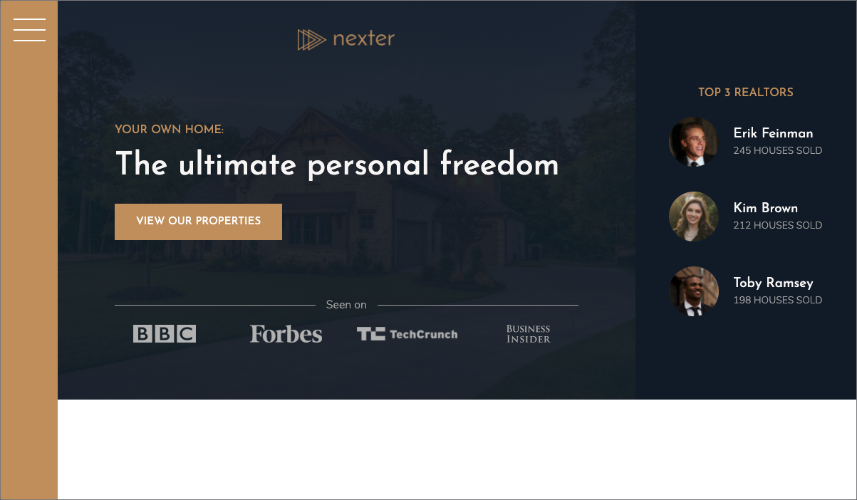
Sample website for a real estate company that demonstrates modern responsive design using HTML / CSS Grid.
The focus of this design is to display the power of the CSS Grid. It is the most powerful CSS tool to build adaptive and responsive website design layouts. Gone are the days of floats, inline blocks, and funky positioning hacks. While Flexbox flexes particularly on one dimensional layouts, CSS Grid spans 2D and takes it to the next level. We put it all together here but utilize the strength of Grid to locate, adjust, and format the display.
Try out the deployed site and try adjusting the screen size for yourself and see it work!
Classes and selectors are built using the BEM (Block-Element-Modeling) design convention and employ complex selectors, and pseudo selectors. Addtionally, the 7-1 rule for component-based design architecture is applied to promote reusable, scalable, and maintainable code.
Responsive design principles are incorporated for users with all kinds of devices using advanced CSS media-queries. Responsive design creates a pleasant user experience that scales from widescreen monitors down to small handheld phone devices.
Technology:
CSS, CSS Grid, Flexbox, SASS, HTML, NPM